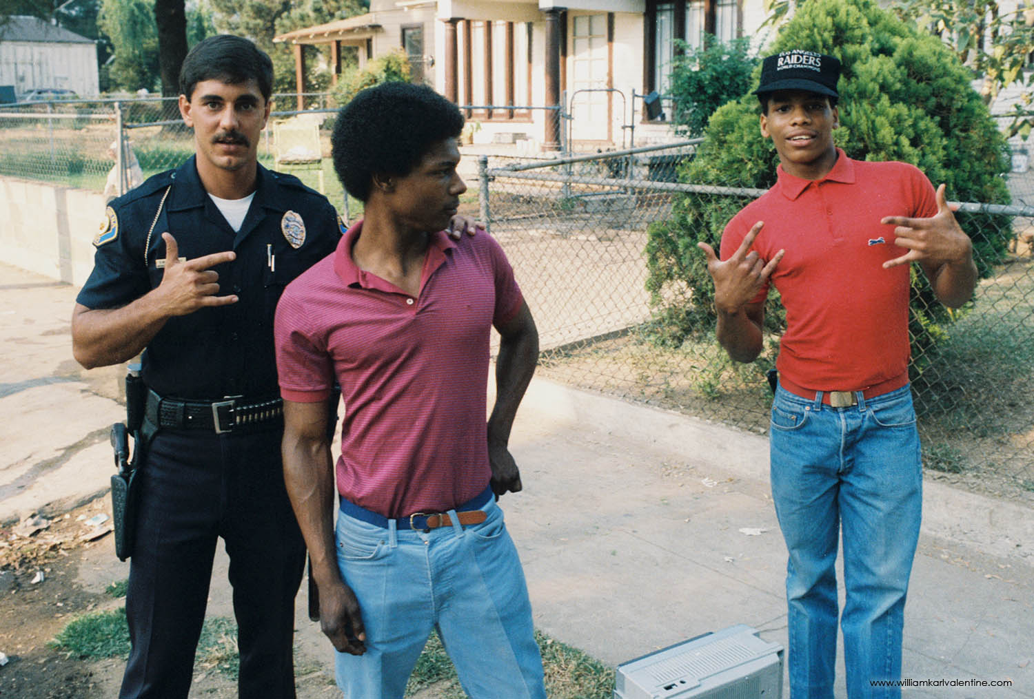
Last November I was really focused on my hometown of Pasadena. I am up there a couple times a week to see my mom and check on things as it is but in November, I photographed the Doo Dah Parade again for the first time in a while and then the Pasadena Polic Department Alumni group on Facebook shared the above photograph which I remember really well from my childhood. I decided to research the image and write blog post about it. I at first thought long time Pasadena Star News Photographer Walt Mancini captured the image but after figuring out which issue of Life it appeared in, and actually purchasing a copy of it, I learned it was Ed Norgood’s photograph. Ed was another well-known Pasadena press photographer. I started writing this a month ago then all hell broke loose so I am just know trying to get caught up. As photographers I think there is value in looking at other photographer’s work. Most often that is involves examining images to understand the medium better, but in this case, I think seeing the life path that photography gave to Ed is also a valuable lesson.
Pasadena has been home to a number of good photographers, especially a number of good Press Photographers like John Lloyd, Walt Mancini, and Ed Norgood who captured the image above. For a press photographer I think Pasadena was ideal at the end of the last century because the Star News, the local paper, had great circulation, there were plenty of unique events to cover in Pasadena with the Rose Parade, Rose Bowl game, Super Bowls. Other prominent places like The Huntington Library, JPL, and Cal Tech are in Pasadena plus they got to cover events in Los Angeles because it was so close. It was the best of all worlds for a press photographer because you often had small town pace but then big-time action (and back then a paycheck). The pace allowed Ed Norgood the opportunity to see this image, photograph it, and get it published - eventually having it published in Life Magazine.
There have been other photographers come out of Pasadena like Adam Clark Vroman and myself (sorry I couldn’t resist) plus Pasadena City College had an outstanding photography program when I was there with people like Walt Girdner, “Uncle Walt”, who taught me my first photography class. I was lucky to be born and raised in the area.
The General
Often with a great image we lose sight of the people in them or at least their own story beyond the one image. Tom Young was a legendary officer at Pasadena, not only because he was a beast of a man but just because how well he controlled situations on the street. His nickname was the General and everyone loved working with him. The number of great comments about him on the Facebook post were amazing to read. I remember my dad showing me the photograph when I was a little kid and being proud that his friend, and someone from Pasadena PD, had been featured in Lide Magazine.
Interview by: Scott Swanson
Below is an interesting interview I found of Ed from the really small-town paper where he retired. I think it is an outstanding piece and gives insight in to why photographers photograph. The link is below, and I also copied and pasted the whole story because it had problems loading for me a couple of times.
The New Era - November 28, 2007
Edwin Norgord didn’t grow up intending to be a news photographer.
He actually intended to be an agricultural inspector in the citrus orchards of Southern California in the early 1950s.
But when that didn’t work out for him, he decided to take a photography class and ended up working for a Pasadena newspaper for 35 years, during which he shot movie stars, presidents, sports heroes and a lot of everyday human-interest photos, which were some of his favorites.
“The reason I love newspaper photography is because I dealt with people in all walks of life – the good, the ugly, the rich, the poor,” said Norgord, who will be 78 next month. “I’ve seen football players cry – just the emotion of people, trying to capture it on film.”
He did it well enough that he was recognized by his colleagues as the California Press Photographer of the Year in 1970.
Norgord was born and raised in Pasadena, Calif., about 10 miles northeast of Los Angeles, one of a family of seven children. He attended Marshall High School and John Muir Junior College during World War II before joining the Air Force in 1948 and serving in Japan during the Korean War.
After he was discharged in 1949, he enrolled in the Voorhis Unit of the California Polytechnic School in San Dimas, about 20 miles east of Pasadena. The college was all-male, so he and his buddies would cruise to other, all-female, campuses for social interaction.
“We had to go to the girls college in LaVerne (a few miles to the east) if we wanted to gallivant,” Norgord recalled. “When I got discharged, I bought a brand new car, a 1950 Chevy, and all the other college boys wanted to ride around in my car because it had skirts and pipes. That was my downfall because we were driving around to different girls schools and I wasn’t keeping up on my studies.”
Norgord said he also discovered that majoring in agriculture wasn’t for him.
“I couldn’t dissect leaves very well,” he said.
Transferring to Pasadena City College, he took a photography course and started chumming around with a friend, Elton Sewell, who was a photographer for the Pasadena Independent, a local tabloid newspaper.
“He got me started, really,” Norgord said. “He lent me a camera to use. I started to take pictures for the Independent – human interest, weather, accident photos.”
The editors liked his stuff and when an opening came up, they hired him to work weekends as a part-timer. He started working for the Independent full-time in 1954.
He said he particularly enjoyed working for Fred Runyon, the editor.
“He was the nicest guy you’d want to meet,” Norgord said. “A super, wonderful guy.
“One time when I was in the darkroom, I had taken a picture of my father-in-law taking a sliver out of his granddaughter’s hand. I walked into the house and saw him about ready to take the sliver out.
“I said ‘Hold it!’ and I ran out and got my Speedgraphic camera. They were under a desk lamp, so I took the bulb out and plugged a flashbulb into the lamp using this converter I had. Then I told them to go ahead and take sliver out. By the time I put the (film) slide back in, and got another negative in, he had the sliver out and the moment was past.
“I was in the darkroom printing this up, when my editor walked in and saw the print. I thought he was going to raise hell because I was doing this on company time. He said, ‘I’m going to fire you, Eddie, if you don’t enter this in a national contest.’ I did and got second place.
“He let reporters do whatever they wanted as long as they got job done.”
Norgord said he really enjoyed working with the reporters at the Independent, whom he said were “wonderful people.”
There was a lot of camaraderie and cooperation between public officials and the press, he said.
“In those days, if we all hung out in the press room at the police department, if there was a fire alarm, all of us photographers – from the L.A. Times, the Examiner, the Independent, the Herald Express, would jump in one car and follow the police car through red lights. They really worked with us in those days.
“Firefighters would urge us to go up the ladder to shoot a picture from the roof. They were very, very cooperative then.
“When one of the photographers was drunk, we’d shoot a holder for them.”
The job was enjoyable because it had challenge and he enjoyed working with people.
The whole idea of taking pictures is to try to illustrate a story, Norgord said, noting that the ability to spot situations with photo potential is key. One time, he said, he was supposed to shoot a photo to illustrate the start of spring.
“I went out and found a flower growing out of a spring sticking out of the ground in a vacant lot. You’re looking for things like that. It feels so great to go in and put a print like that on (the editor’s) desk.”
Norgord said he shot “lots of movie stars” including Bob Hope, Frank Sinatra and Gene Autry. He visited stars’ homes in Pasadena as well.
He also shot several presidents, but he particularly remembers one, Richard Nixon.
“I was really impressed by his brilliance, his speaking ability,” Norgord said. “He had an incredible memory. But I was jinxed by him.”
The first time he shot Nixon was at a hotel in Arcadia, near Pasadena. The president walked by, entering the hotel, and as Norgord was taking a photo, his Speedgraphic flash fell off and landed on Nixon’s foot.
Then, a few years later, he was at Nixon’s alma mater, Whittier College, about 15 miles south of Pasadena. Air had gotten into one of his flashbulbs, but as he reached into his bag to grab a bulb. he didn’t notice that the indicator dot on the bulb had turned pink, an indicator that the bulb was defective.
“I took a photo of him and Pat on the football field as he was giving a talk and my flash exploded and made a loud noise, flame shot out, and it sent glass all over him and Pat,” Norgord said. “I was so embarrassed by that. If it had been today, I would have been shot before I could explain.”
The last time Norgord photographed Nixon was at the Ambassador Hotel in Los Angeles. He and reporter Lou Spear went to Nixon’s room and after they were searched by a Secret Service agent, they entered the room where Nixon was sitting in a swivel chair.
“He swiveled around and looked at me and pointed his finger at me. ‘I know you, I know you,’ he said.
“I said, ‘Sir, do you want me to leave?’
“He said, ‘No, come on in.’
Norgord wanted to shoot the photo with available light but he had to avoid shooting a profile of Nixon’s nose, by the president’s request.
“He is one president who uses hand language. He speaks with his hands,” Norgord said. “I got some tremendous shots of him. When I went back, they were on deadline. They ran a one-column mug with no hands or anything. That upset me a little bit.”
One of his more exciting experiences was during a forest fire that he covered soon after starting with the Independent. He drove into the mountains north of Pasadena and found a camp full of firefighters who were sleeping after working on the fire line.
“I was taking pictures when the fire captain told me I had to leave because they were evacuating because the fire was coming toward them,” Norgord said.
As he left, he made a wrong turn on the dirt road and drove for miles on a road that was too narrow to turn the car around. Suddenly, embers started raining down on him and the car began overheating because the air temperature was about 115 degrees due to the advancing flames. Norgord was also almost out of gas.
Finally, he came upon a highway patrolman who was blocking the road.
“He said, ‘I thought the road was burned out back there,'” Norgord recalled. “I couldn’t talk because my throat was so dry.”
The police officer let him through and he made it to a nearby ranger station where he was able to beg a couple of gallons of gas. He also got a ride on a water tender to the fire.
“I ended up getting some of best fire photos of my career there,” he said. “They ran in our paper and in a magazine called ‘Stag.'”
The assignments he “dreaded” were “high-society” shots.
But, he said, even they sometimes turned out to be less than onerous.
“The people who had the money didn’t have to prove it,” Norgord said, relating a story of the time he was on an assignment in which he and a “society lady” drove up a long, brick driveway.
When they got to the mansion at the top, the woman went into the house and Norgord started talking with a man who was pruning roses nearby.
“When we left, the lady said, ‘Ed, do you know who that was?'”
Norgord said he assumed it was a gardener. Turns out, he said, it was the vice-president of Standard Oil.
Sometimes, he said, news photos didn’t come easily even when they were easy to get to.
That happened on June 6, 1968 after Robert F. Kennedy was shot by Sirhan Sirhan in the kitchen of the Ambassador Hotel. Sirhan’s mother worked at a local Roman Catholic church and Norgord went to try to get a photo of her.
“I went to the church where his mother worked and the priest asked me what I was doing there,” he remembered. “I said, ‘I’d like to take a picture of Mrs. Sirhan Sirhan if you haven’t told her yet.’
“He said, ‘We haven’t told her yet but we don’t want you to take a picture when she finds out. ‘
“I said, ‘I respect your wishes, but this is not local news, this isn’t even national news. This is an international story. I’d like to record this for history.’
“The priest said, ‘You know, you’re right.’ He said he’d let me take one picture when they told her.
“Sometimes you have to talk your way into news photos.”
Norgord worked at the Independent until the Knight-Ridder company bought the newspaper in 1988 and merged it with the Star-News. He was 58 and he decided to retire.
He and his wife moved to Mono Village, a resort outside Bridgeport in the eastern Sierras. He worked at the boat dock and in the grocery store and stopped taking photos for a while, he said.
“I loved my work while I was at the newspaper, but I had to get out,” he said, adding that his departure was hastened by a change in management.
After a divorce from his first wife, Norgord married a “long-time acquaintance” and they moved to Sweet Home in 1992.
“I loved the country, the outdoors and I wanted to get away from the big city,” he said.
His wife, Sherry, works for the Linn-Co Credit Union.
“She’s quite a bit younger than I,” Norgord said. “That’s what keeps me young.”
Now that he’s retired, he still has an interest in photography. He’s been drafted as the official photographer at the Evangelical Church and he’s still a member of the Los Angeles Press Photographer’s Association, so he enjoys seeing the work of photographers he knows who are still in the business.
The technology has changed drastically since he stopped taking news photos – news photographers have switched to digital and the darkrooms at most newspapers are obsolete.
“I have a digital camera now,” he said. “I’m still learning about it. Today I’m so blessed to have a self-focused, automatic camera now because my eyes are bad.
“Photography has gone a long way – It’s a lot easier to cope with than back in my day, especially with a Speedgraphic.
Photography was fun, mainly because of the people he worked with, he said.
“To me, it was a God-given great job that I had,” Norgord said. “I worked with wonderful people. Most people don’t have a job that they enjoy that much. I got an awful lot of prestige in my job. It was quite a reward to open up the paper and see your work in it. “
Photographer Ed Norgood (featured photograph for this blog post is visible behind him.
Technology today is in many ways wonderous. First I was able to be reminded about this image I remember from my childhood by a Facebook post on the Pasadena PD’s alumni group’s page that I am a member of. From there I was able to research the Life issue more, find multiple vendors across America selling copies, and I was able to order one in very good condition to add to my photography collection. Finally, from there I was able to search the web for more information the photographer Ed Norgood. I found a needle in the haystack by locating the above article from 17 years ago (almost to the day) by a small-town paper in Oregon where Ed had retired. Those are all the cool things. But the pace of today’s world has pretty much killed, or permanently changed, all the big print media like picture magazines and major newspapers. I grew up with the Pasadena Star News, it somehow still survives but it is a shell of what it once was. Multiple small papers have been condensed into it, so it covers a massive era in less depth and the staff is a fraction of what it once was. I touched on this with my Doo Dah Parade blog post that will follow this post. Old magazines and newspapers are amazing documents well beyond the individual story you are referencing back to today. these publications allow us to have a more complete picture of the moments in time they documented and that is something we are losing now with or instant gratification look and swipe world of digesting information. Another thing we are losing is in this era you knew your news source and over time you could develop a trust of, or a distrust, of your source because it was mostly consistent. Today we see so much information from so many different sources many of which we have no idea how reliable they are. It is truly a double edge sword that I fear will do more damage than good over time unless there are fresh ideas on how to improve how we vet today’s sources. This is going to get especially had soon because of all the AI content that is and will be generated in the coming days.
Below are six images from the same Life issue that I found interesting. 55 years ago they were reporting on Presidents and global warming which we are still talking about but look at the products being advertised! The country was aware of women’s rights but related it to cigarettes which now have limited advertising and less users. Every cellphone now produces better video quality that Kodak’s movie camera. Then finally we are now moving to electric and hybrid vehicles instead of this gas hog Continental Mark III (which is amazingly gorgeous beast).


