I drove the 500 miles home from Tucson on Sunday afternoon after everything with the Legacies of LIGHT symposium wrapped up. The next day I headed to Pasadena to check in on my mom and run some errands.
I stopped in at Samys Camera to get a couple things and to tell my friends there about the experience I had at the symposium. While talking with Jeff O’Brien he told me how the prints on the store’s small gallery wall had been up almost three months and he wanted to get some new photos up. He knows my work well and asked me to come up with something. I immediately agreed and started thinking about what I would do.
This reason I am going in to so much detail with this blog post is I want to give the reader insight into my thought process and approach to a simple exhibit so they can better understand approach to photography.
I realize the back wall of a camera store is not necessarily prestigious but in this case it had a lot of value. First of all the wall is very prominent and accessible. Almost every customer sees the wall when the exit the store and any customer going to the rental department walks right by it. This store has lots of knowledgeable photographers who are customers, plus it is two block away from a Pasadena City College which has an outstanding photography department. So the volume of potential viewers is very good.
I grew up in Pasadena and went to Pasadena City College, for me there was sentimental value to go home again. I had also exhibited work at Flags Photo (camera store) in Pasadena during the 1990’s, the store Jeff’s father had owned. I know that most any opportunity to showcase your work is a good thing because you never know who may see your images. I also know the process of editing and presenting an exhibition is a great exercise for a photographer.
When it came to what images to show I knew I had to include the image from my Pasadena PD series which was in the CCP’s Qualities of LIGHT exhibition, but I didn’t want to only showcase images from that series because they are from 34 years ago. I knew I wanted to give an overview of my work when I started editing for it, was thinking a linear display at first, and wanted to highlight images which had been in prominent exhibitions or were in permanent collections. I also had only glanced at the wall, had a guess at the size, but I hadn’t measured it.
Because I wanted to turn the project quickly I decided to make prints specifically for the show and didn’t want to deal with framing them. Michal Raz Russo’s presentation at the Legacies of LIGHT about some of the LIGHT gallery’s installations was fresh in my mind, so I started thinking about a simple way to the present work. The more I thought about it I realized I wanted to avoid a single straight row of prints and that I wanted to break up the pace of the images visually. I decided to make digital prints that were all consistent with each other even if the images were from film. I just can’t bring myself to casually display good silver gelatin prints since it takes so long to make them.
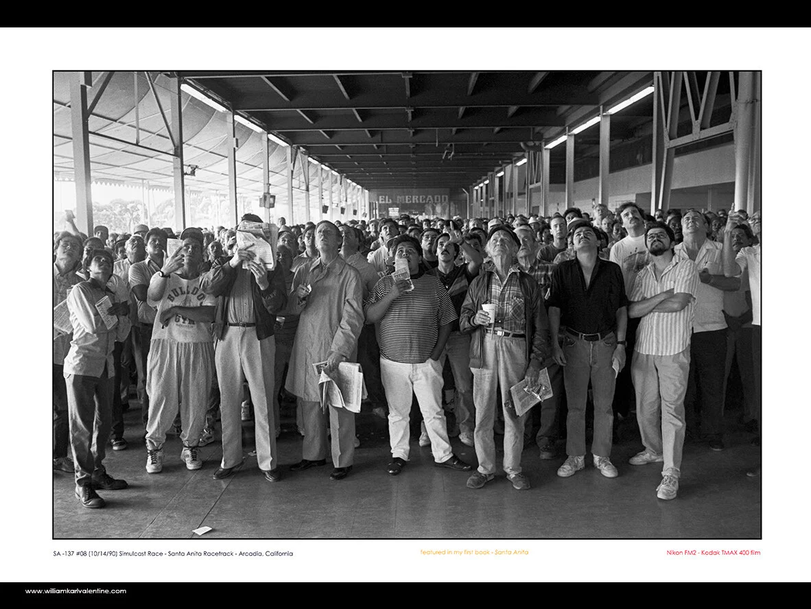
I started going through my image files thinking about which other images would fit. Lee Baroni applying the Carotid hold on the Duster jumped out as a good companion to the CCP image. The photo of Lee is in the permanent collection at the University of New Mexico. The Photograph of the motorcade from Officer Russ Miller’s funeral was another obvious choice. It was featured in the Billboard Creative in Los Angeles a couple years ago and is a signature image. “The Killing Fields” image is in the permanent collection of the Fogg Museum at Harvard, plus it represented my Rio Hondo Police Academy series well. I chose the “Simulcast Race” image from my Santa Anita book because it is one of my favorites. I also wasn’t looking to inspire any more debate over the horseracing industry which an actual horse related image might do. I chose the photo of the Giants coaches to represent my Cactus League series because it really captured how pure spring training used to be. In today’s world I would never be able to access to stand in that position to capture that exposure. I liked the Mariano Rivera image to represent my Wrigley-Fenway-Tiger series because it would help transition well into my street photography images. An interesting side note had never printed the image as large as I did for this exhibition and when I did I found new and exciting details in the image I had not seen in the 23 years since I had made the exposure. The view of the World Trade Center from the Empire State Building was another obvious image and one I have wanted to show more.
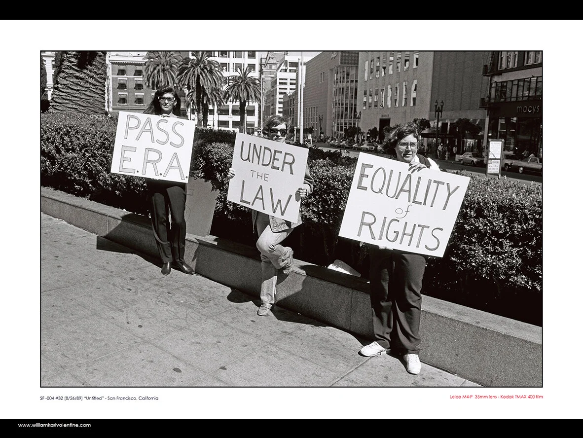
After selecting those 8 images I figured I probably had enough images but decided to choose more images so I would have options in my wall design since I was going to figure things out as I installed it. The ASU pool party image was a good representation of my Alphaville series and I came across a scan of ERA activists from San Francisco in 1989 which really jumped out at me. I have become so tired of today’s world with people who have differing opinions screaming at one another and thinking they are properly applying their 1st Amendment Rights. After these choices I selected five recent images that I keep returning to. I wanted to have images from Chicago, New York, and Newport Beach in the show if I could. One image was in color from the 4th of July and I didn’t think it would fit but I decided to print it and just see if there was a place for it.
Since the prints were just for this exhibition I added text to the prints below the image so I wouldn’t have to deal with identification labels. I put the image information and because they were on display in a camera store I also added information about the camera I used and the film type for the older images. I also listed information if the image was in a permanent collection or had been in a recent prominent exhibition. After making the 15 different prints I made a single 8.5 x 11 print with all the images on it in a rough design which I thought might work. Actually I thought the first four rows would be as they were and the last row was just a reference point of the images, that I would only use a couple of them maybe.
The reference sheet I used while designing installation of the exhibition.
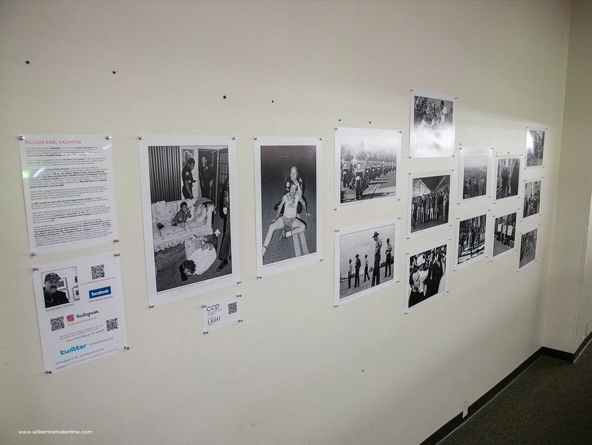
I wrote the artist statement specifically for this exhibition with the primary focus being my connection to Pasadena. Realizing many viewers would be passing by quickly I used bold font to highlight key points so the statement could be quickly scanned. Because I am always trying to increase the exposure of my work I created several QR codes with links to my Instagram and website then created an information page for people who wanted to learn more about my work. I also created a smaller page with a QR code link for the Qualities of LIGHT exhibition.
I decided to pin the images to the wall, because it was a quick and secure way to install the show plus it would do minimal damage to the wall. I also liked the look and feel of presenting that way, but I knew I needed to have metal push pins for it to be right. I thought the idea of the pins was a simple one until it came time to buy them. I literally had to go to four stores to finally get enough pins for the exhibition, thank God for Office Depot still carrying them.
I began the installation process with a tape measure, note pad, and math. I also realized the angle of the floor next to the wall was greater than I remembered since it really a ramp allowing handicap access to the store and easy carryout for large amounts of rental equipment. So obviously the sight line of the space changes and I had to take that in to account.
I always remember from my Northlight days at ASU that the center line of artwork should be like 56” from the floor. I know I am 6’5” and that I like a higher center point, plus I realized the way the store was configured I wanted to have at least some of the prints high enough to be seen above the displays to draw viewers in. Using blue painters tape I marked the center line from the floor up. I taped up a couple test prints and I had my friend who is much shorter than I am go along the wall to find what her eye level was. From that point I went by feel and judgement to adjust the center line and then kept it fairly consistent to the floor by measuring for each new row of prints.
I found that double stacking two vertical images made them too hard to view so I adjusted the Pasadena PD images to go side by side. I decided to pin the prints keeping a 3” gap between all prints. I also used my level with a built-in ruler to keep things accurate. I then kept putting up prints, designing as I went. I had the one-color print left over, but I soon found a place for it. The next section of the wall surface changed, and it had a large framed color print on it which was is a permanent thing but lots of blank wall before it. So, I found a home for the 15th print.
I know this is a relatively long blog post on a simple thing but I thought some readers may find value with the insight in to my process.
This Samys Camera store is located at 1759 E. Colorado Boulevard in Pasadena, California and is open daily 8am to 6pm. I am not sure how long the exhibition will be up, most likely through the end of March.
William Karl Valentine


