On October 7th I had the incredible opportunity to spend two hours talking one on one with Rebecca Morse at the Los Angeles County Museum of Art viewing the exhibition “Objects of Desire”.
Rebecca Morse is coming up on her 10-year anniversary as a Curator in the Wallis Annenberg Photography Department at LACMA. Prior to LACMA she spent 15 years as a curator at MOCA in Los Angeles. Originally from upstate New York, Rebecca worked for a commercial photographer in New York City and earned her Master’s degree at the University of Arizona before moving to Los Angeles. Rebecca curated the “Objects of Desire” exhibition and authored the accompanying catalogue for the exhibition.
Here is LACMA’s Statement for the exhibition:
“Objects of Desire: Photography and the Language of Advertising traces the artistic manipulation of advertising, the most powerful, mainstream visual language. Since the 1970s, creative innovations led to dramatic shifts in the possibilities for photography as artistic expression, as photo-based artists reworked advertising strategies to challenge the increased commodification of daily life, and later to appropriate the command these images have over the viewer/consumer. By exploiting advertising’s visual vocabulary and adopting its sites and formats, and through re-photography, appropriation, and simulation, artists create a shared photographic language that puts the onus on the viewer to determine what exactly these pictures are asking of us.”
I appreciate diversity in photographic styles although I always gravitate toward documentary images because that is my style. I think it is important that all genres of photography are showcased, and I try to view as many different types of photographs as I can to keep up my knowledge of the medium. Viewing other images and talking about photography always helps me refocus on my own work. My expectation in viewing Objects of Desire was that I would learn something new and hopefully see a couple images I could connect with.
The Objects of Desire exhibition exceeded my expectations. It is truly amazing, one of the tightest exhibitions I have seen. It has some images I was familiar with, some work by photographers I had never heard of, and some totally unique pieces like Urs Fishcer’s “Mirror Box” series. What made this exhibition so outstanding is how Rebecca Morse curated and designed the installation such that seemingly eclectic works when put together are in fact totally congruent with the goal of the exhibition. The pairings make perfect sense when you follow the chronology and sequence of the installation.
Obviously, there is nothing like viewing an exhibition with the curator who is sharing insights on how they constructed the exhibition. That was a huge advantage for me. But if the average viewer follows the wall signage the story is laid out in a clear, concise and easy way to understand manner. I don’t think Rebecca missed a single detail; the show accomplishes exactly what the statement says.
I had never met Rebecca before, and I earned this private tour by winning a fundraising bid for the Los Angeles Center of Photography, so I didn’t fully know what to expect. What I discovered is an amazing photography professional.
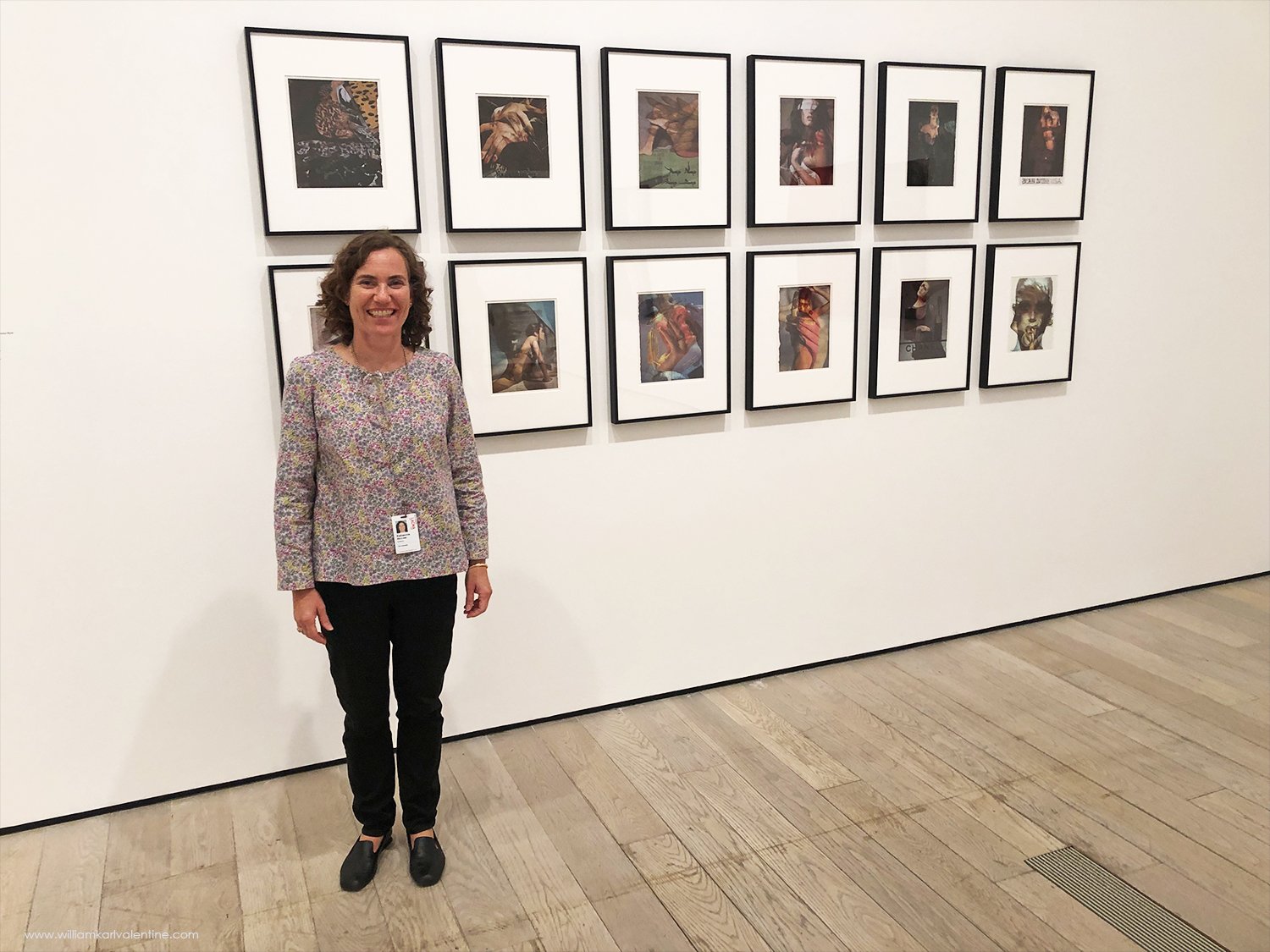
I gained a ton of insight into the curator’s mind with this visit, which was one of my goals. Rebecca talked about how the concept for the exhibition formulated over many years, and as I expected her interests and experience were the foundation. There was one specific image (Ericka Beckman’s 1987 image “Spoonful”) I had never seen before. Rebecca explained that she had seen the photograph years ago, how the image stayed in the back of her mind, and when she had the right exhibition for it, she remembered it. We also talked a lot about presentation and design of the space. I loved hearing about the many details and fine adjustments, and I could see how each thing she mentioned made the exhibition better. We ended up talking about every piece. I knew that Rebecca had worked with Robert Heineken when she was at the University of Arizona and the Center for Creative Photography was adding Heineken’s archive to their collection. I enjoyed the opportunity to talk to Rebecca about his work given her firsthand connection to it and that’s why I made a point to photograph Rebecca by Heineken’s work.
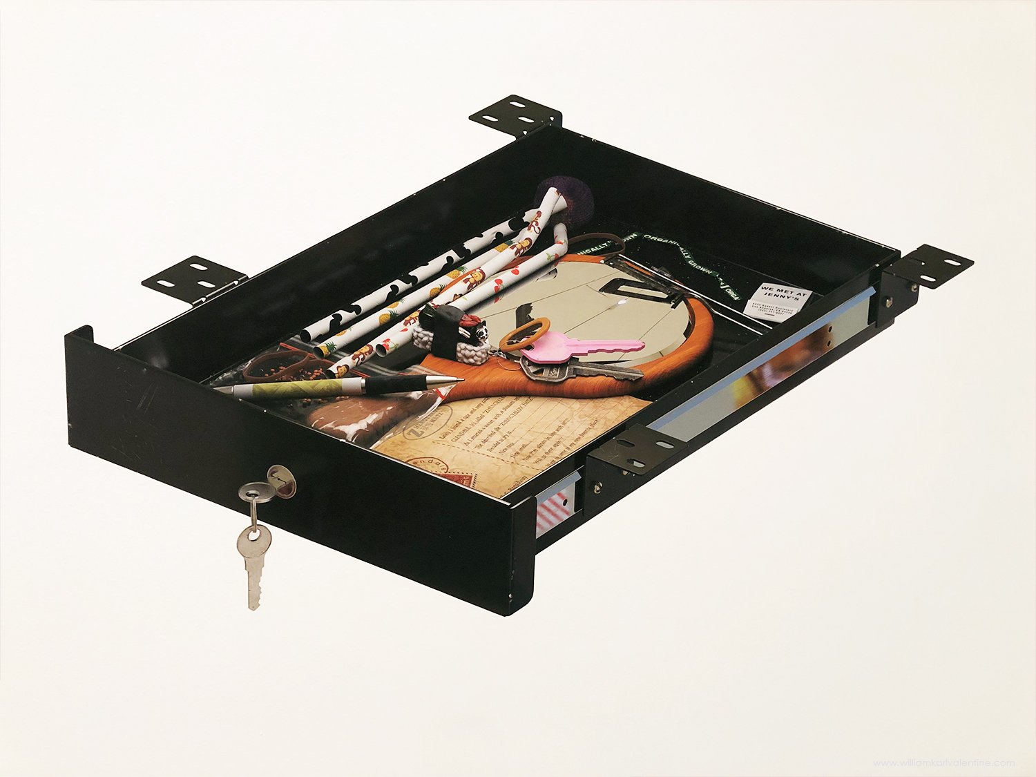
I found it particularly interesting when Rebecca pointed out the reflective qualities of Sarah Charlesworth’s Cibachrome “Figures” and Vikky Alexander’s “St. Sebastian” and how the viewer’s reflection on the surface of the prints was such an important element of the viewer’s experience. The importance of the reflective quality of Urs Fishcer’s “Mirror Box” series was more apparent, but in talking with Rebecca I learned the placement of each box had been carefully considered. If a box was moved one way or another the reflected background would be completely different. Asha Schechter’s 2020 print “Junk Drawer” is unlike any other exhibition photograph I have ever seen. It is an inkjet print on adhesive vinyl and it was made specifically for this exhibition and the precise location in the gallery where the print hangs. The drawer which was photographed to create the image has reflective surfaces although the print itself does not have reflective qualities. But when you look at the print it appears those reflective surfaces are mirroring the lights and other objects in the room because Schechter actually photographed the room during installation and added those elements to his print to appear as if they are reflections. The perspective of the drawer also seems off with the back of the drawer appearing to be bigger than the front of the drawer which is closest to the viewer. In the catalogue Rebecca describes this print as being based on reality but feeling “off kilter”, she’s right, I found it to be subtly bothersome and I respect that.
I also enjoyed listening to her thoughts on the scale of certain pieces and the overall design element regarding placement of work. I know how much effort I put in to editing my own work, it takes a lot of time and focus, but to hear Rebecca talk about her curatorial process for an exhibition of this scale is a completely different level.
One other thing I enjoyed on my visit was watching other patrons view the exhibition. Rebecca also liked being in the gallery when no one realized she was the exhibition curator so she could stand back and see what people were drawn to and how they experienced the exhibition.
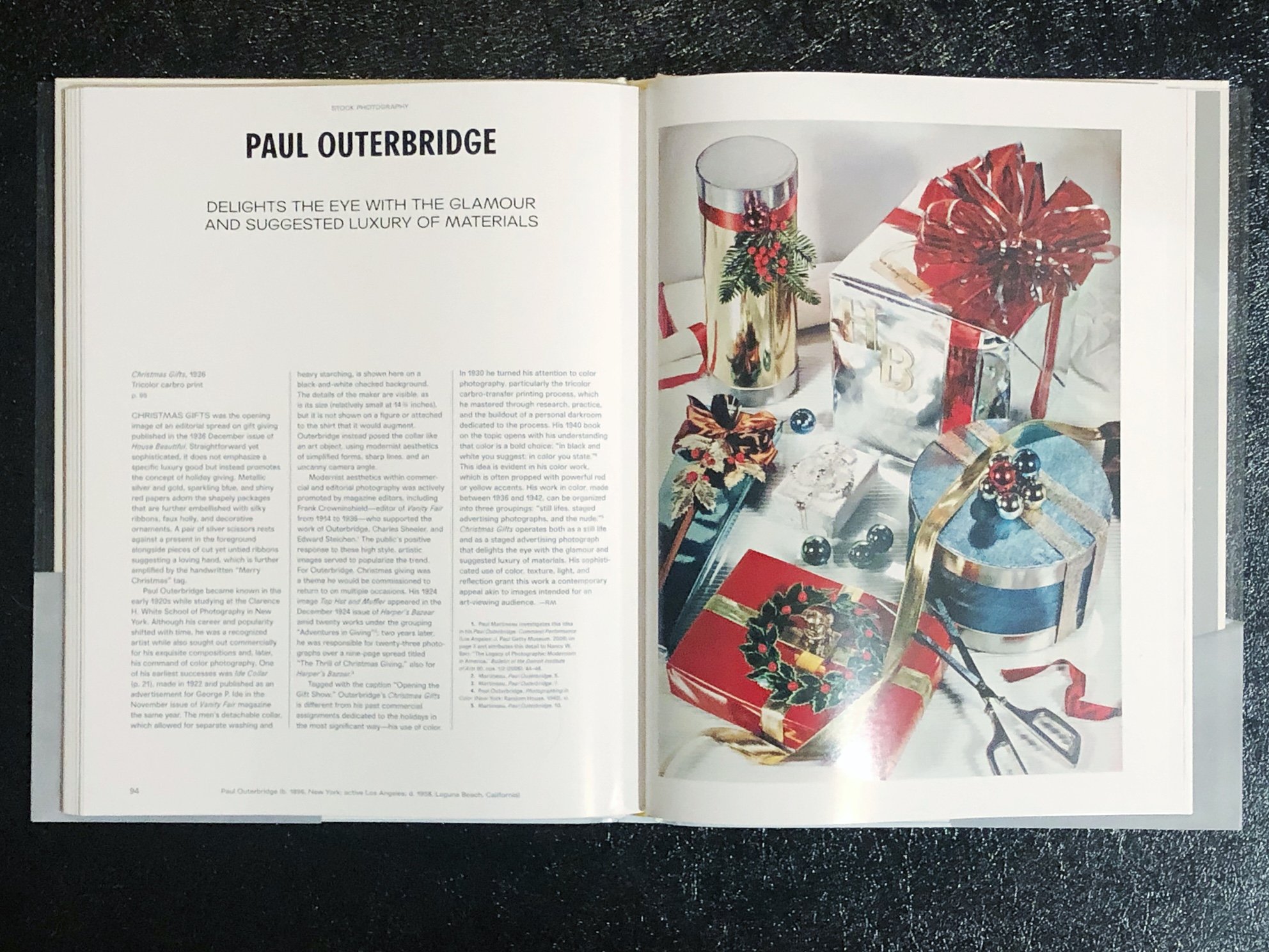
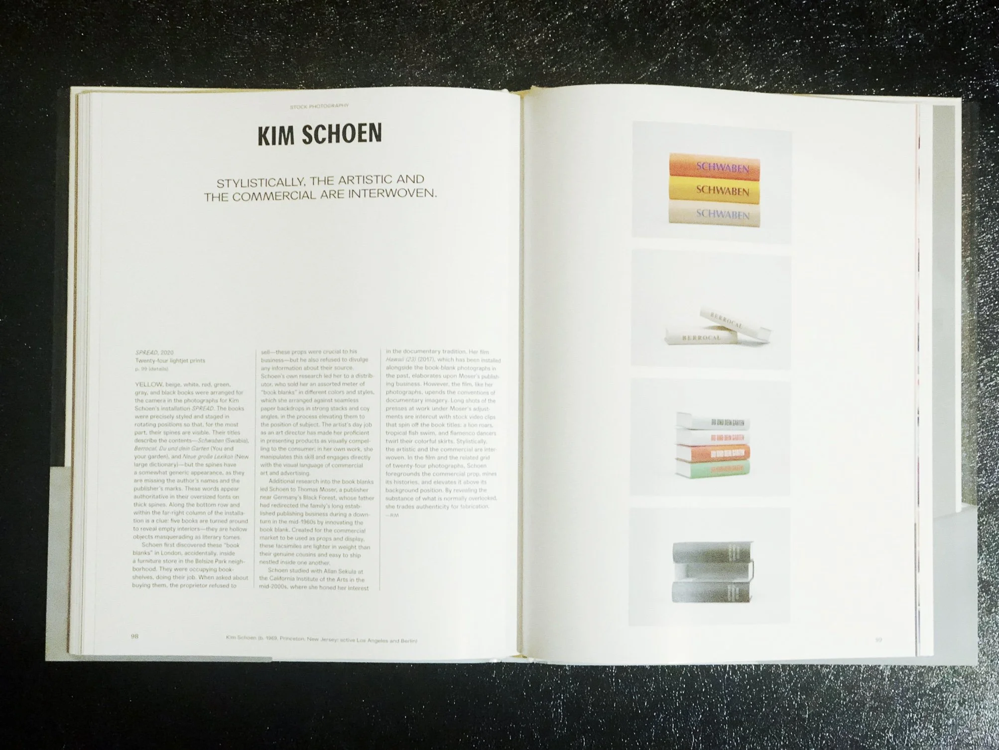
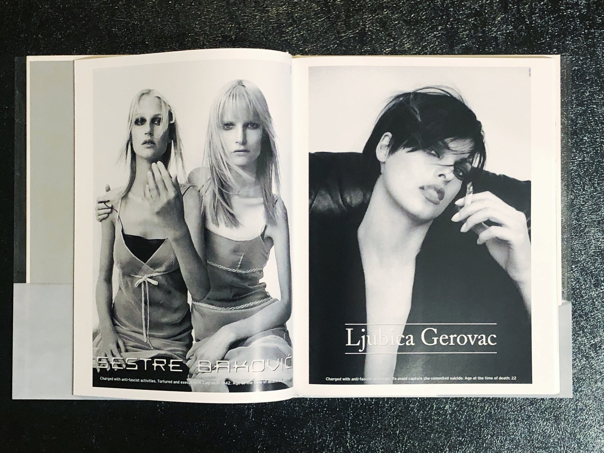
Rebecca also authored the accompanying catalogue for the exhibition which is one of the best exhibition catalogues I have ever seen. It explains the overall exhibition nicely and showcases many details about individual works. If you get the book and read the Acknowledgements you also get insight in to how many people are involved in producing an exhibition of this scale too, it definitely takes a good team. David Karwan designed the catalogue and he did a fantastic job capturing the magazine / advertising spirit in a beautifully published book. LACMA co-published the book with DelMonico Books.
The Exhibition runs until December 18th, and I highly recommend a visit.
