Deana Lawson’s photographs were in the Lower-Level Gallery at the High when I visited. This exhibition originated at the Institute of Contemporary Art/Boston (ICA) and was curated by ICA’s Chief Curator Eva Respini along with former MoMA PS1 Chief Curator Peter Eleey. Lawson is a professor at Princeton, and this is the first museum survey dedicated to her work. I was not familiar with Lawson’s work before seeing this exhibition.
I have mixed feelings about this exhibition but taking everything into consideration I did like it, and I think it has value.
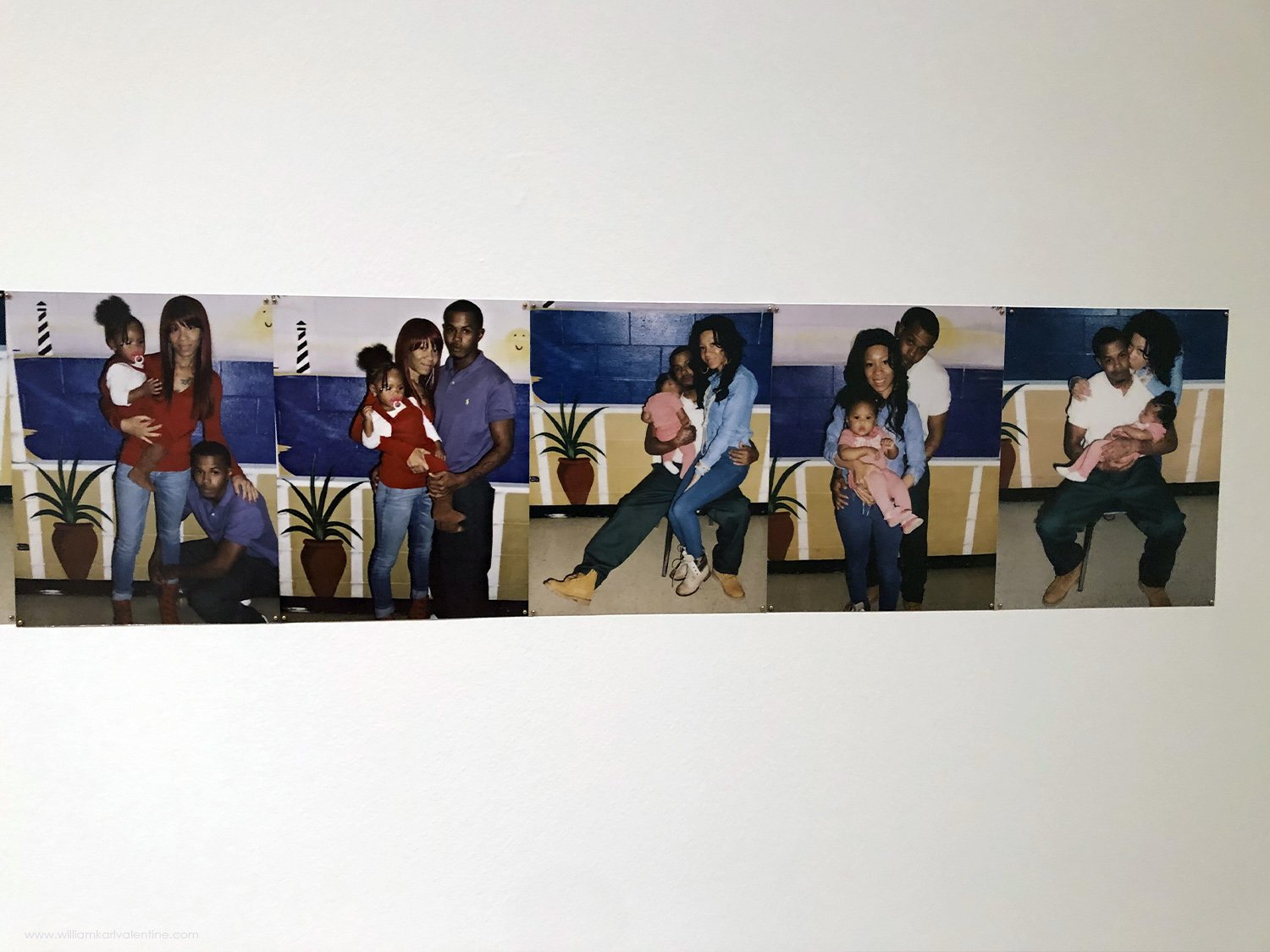
The exhibition is staged very well. The space is amazing, the prints are good, and the work placement is solid. I also think the timing for showing Lawson’s work was perfect and it seemed to be very well received. I was in the gallery, in the last hour before closing, and I probably saw a couple dozen patrons. About two thirds of those people were African American, and their engagement with her work was incredible. Most were in groups of four or people and many appeared to be in their mid-20’s. People in each group were talking with one another about individual photographs and talking about their response to the work. They weren’t afraid to get up close and look at details in a photograph, take a cellphone photo of it, step back look over the whole photograph again and then take another close look at it. It was some of the most interaction with work in a museum I have seen, and everyone seemed excited about the work, as if they were connecting with it personally. It was a unique energy, and I sensed a lot of people felt this exhibition was specifically for them. I eventually introduced myself to one of the groups as a visitor from California, mentioned how they looked engaged with the work, asked them what they liked about the exhibition and if there were any photographs that stood out to them. I may have caught them off guard approaching them in that setting but they were very nice and took a moment to talk with me. They all thought the prints were beautiful and powerful; I agree with them, the scale of the work is perfect and printing quality very good. The consensus was they thought the work showed the people featured in a positive light and highlighted their strengths. Both the men and the women in the group seemed to be drawn more to prints with female nudes. I saw every group stop and spend time to examine the montage of photographs pinned to the wall, that piece (feature above) definitely got everyone’s attention. This exhibition does an outstanding job of fulfilling the High’s mission goals. I suspect the Lawson exhibition is bringing in new patrons who may not have considered the High as being a place for them before this exhibition went up. It is also nice to see the work of a photographer under 50 get an exhibition of this caliber.
One of the people I spoke with showing me which Lawson photograph he liked best on cellphone
Okay so now I need to address why I have mixed feelings about this exhibition. I think it is best to start with Lawson’s exhibition statement about the work to get a better understanding of it:
“Featuring work made over the past two decades, this exhibition is the first museum survey dedicated to Deana Lawson. Working primarily in photography, Lawson investigates and challenges conventional representations of Black identities and bodies. Her work evokes a range of photographic histories and styles, including family albums, studio portraiture, and staged tableaux; she also employs documentary pictures and appropriated images.
In Lawson’s highly staged scenes, individuals, couples, and families are pictured in intimate domestic spaces and public settings, interacting with one another. The artist describes her work as “a mirror of everyday life, but also a projection of what I want to happen. It’s about setting a different standard of values and saying that everyday Black lives, everyday experiences, are beautiful, and powerful, and intelligent.” Lawson’s practice is global in scope, as she creates her images throughout the African diaspora in locations as varied as Brooklyn, Haiti, Jamaica, Ethiopia, Brazil, the Democratic Republic of the Congo, and the Southern United States. This broad geographical range points to a collective memory of shared experiences and various cultural histories of the past.”
What I am struggling with is that so many of these images look to be documentary photographs, but they are actually carefully staged, and the environment altered. If they were straight documentary images, they would be powerful, they would be capturing life within a segment of our population and thus allowing us to explore and appreciate it. But when Laswon alters them, she alters their factual value. I love Julie Blackmon’s work, it is amazing. With Blackmon’s work it is obviously staged and orchestrated. As a viewer knowing this, when I see her photographs, I know I need to look for her message in her image. Blackmon usually has an obvious message with subtle layers of messages. Taking Deana Lawsons’ statement and applying it to her images I can’t always see the connection.
Here are some examples:
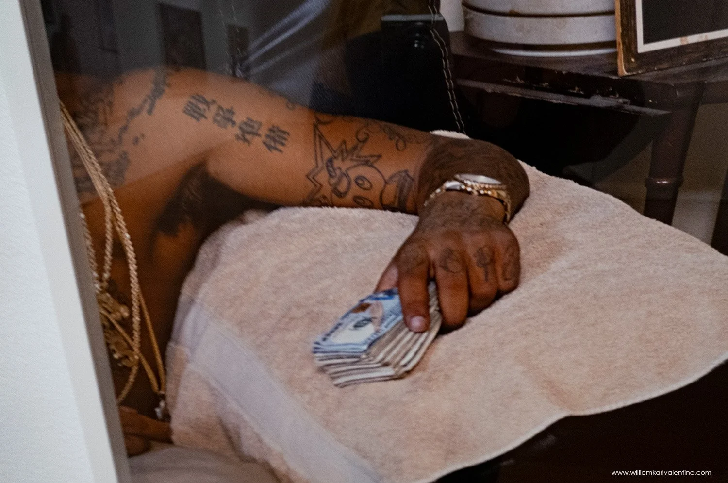
So, Lawson said this about her work: “it is a mirror of everyday life, but also a projection of what I want to happen. It’s about setting a different standard of values and saying that everyday Black lives, everyday experiences, are beautiful, and powerful, and intelligent.” When I view this image, I see examples of everyday life, but I am confused what the different standards and values she is championing here because there is so much going on. Obviously, there is the suggestion of the proud father caring for his son which stands out. But then when I consider the title is “Sons of Cush” (“Cush” is slang for a powerful type of marijuana with a high that lasts a long time), the tattoos, gold chains, and cash on the person to the left, the aluminum foil preventing people from looking inside apartment, with my background in law enforcement I start to connect this image with drugs dealers. I have no idea where the white board is taking us, references to colonization in Africa along with scripture verse, it is all over the place. Then there is the apparent photo of an older black woman who had been a nanny to a white girl and an empty Chips Ahoy cup on the side table and so many other elements added to the photograph. Plus, the fact that the photograph is staged with all this furniture next to the front door (I can see the dead bolt lock) in an awkward unnatural manner is something I don’t understand. In reading Patricia Davis’s comments about the photograph on the accompanying title card (a photo of this is above) I see this photograph is about the strong father figure and the rejection of the stereotype that some African American men are poor fathers and that the “Sons of Cush” title relates back to the Kingdom of Kush in Africa. Okay I can see the father element in the photograph but what about all these unique components in the image frame? Is there is a reason for them? and if my interpretation is correct about the house then as a good father why is he still in there with the child? If the message is only about the man being a good father to his son, rejecting stereotypes, I think the image could have been created where that statement is clearer. If there are multiple layers of meaning to this image, then I wish Davis would have identified them. I also don’t see how the image “Cleverly prompts the viewer to make the connection” that this is a strong father figure as Davis claims. If the meaning of this image was so obvious, then Davis’s statement would not need to accompany the work.
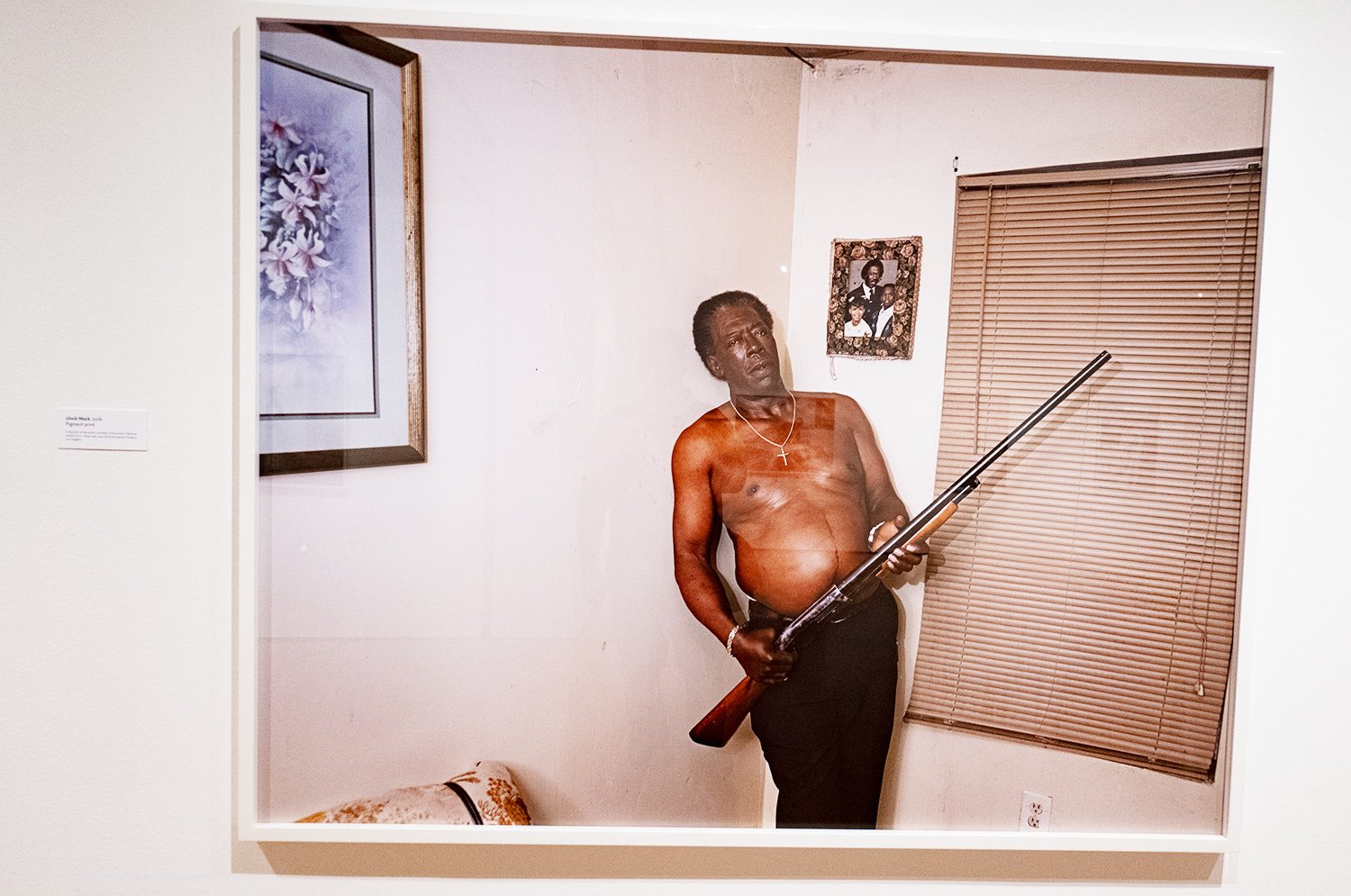
“Uncle Mack” - Deana Lawson 2016
Knowing that “Uncle Mack” was a posed photograph I want to know why it was framed like a Polaroid snapshot with those elements in the frame. He is holding a shotgun, but it is a hunting style gun with a long barrel. Mack is shirtless, he is wearing a cross necklace, has no tattoos, and the house décor is generic. He is standing in the corner by a window. I have absolutely no idea where Lawson is taking us with this image. In today’s world guns always bring out negative connotations or suggest the presence of a threat, but Uncle Mack looks like an average guy in an average house. The exhibition plate just had the title nothing more.
I think this is powerful portrait, I see strength and some simultaneous vulnerability. I think the interior is an important part of the documentation too, but I am not following the unicorn toy and the TV remote placement. Is it a suggestion she is a parent while still being a woman? As soon as I knew that Lawson carefully constructed her images, I paid attention to every detail assuming each was another key to the meaning of the image. If the items are not important elements that is okay but then they become distractions if they appear to be out of place.
Mohawk Correctional Facility installation:
The Mohawk Correctional Facility family portrait installation is outstanding. I know Lawson rephotographed her cousin Jazmin’s snapshots from visiting her partner Erik in prison, but I am fine with that because she curated the photographs into a timeline and this installation in the High is perfect. The timeline positioning is very powerful. With my law enforcement background, I have seen snapshots like theses lots of times and I understand the dynamics these families go through when a parent is serving a prison sentence.
Conclusion:
As a whole Lawson’s exhibition has value. Some of her portraits are very powerful and hit the mark well. As I detailed above, I find the message in parts of this exhibition difficult to understand and I think there maybe ways that could be corrected, in some cases maybe just with more detailed signage. I was interested in seeing other opinions on this exhibition, but I really wasn’t able to find reviews of this exhibition online. I found a few announcements about it, but they never seemed to go beyond repeating the initial exhibition announcement. I was very pleased to see the amount of community connection to the work and for that fact alone I think this exhibition is a success.


